

Light Colour Temperature Guide: Kelvin Chart, Types & Best Uses
22nd September 2025 | Written By: Rika Aash | Read Time: 3min | Last Updated: 07th October 2026
You must have come across the term ‘light colour temperature’ many times while shopping for lights for your spaces. But do you know what it actually means? And why is it important to understand its use and applications. In this blog, we will understand what is colour temperature, different types of colour temperatures, and their applications.
Complete Guide to Light Colour Temperatures and Applications
What Is Light Colour Temperature?
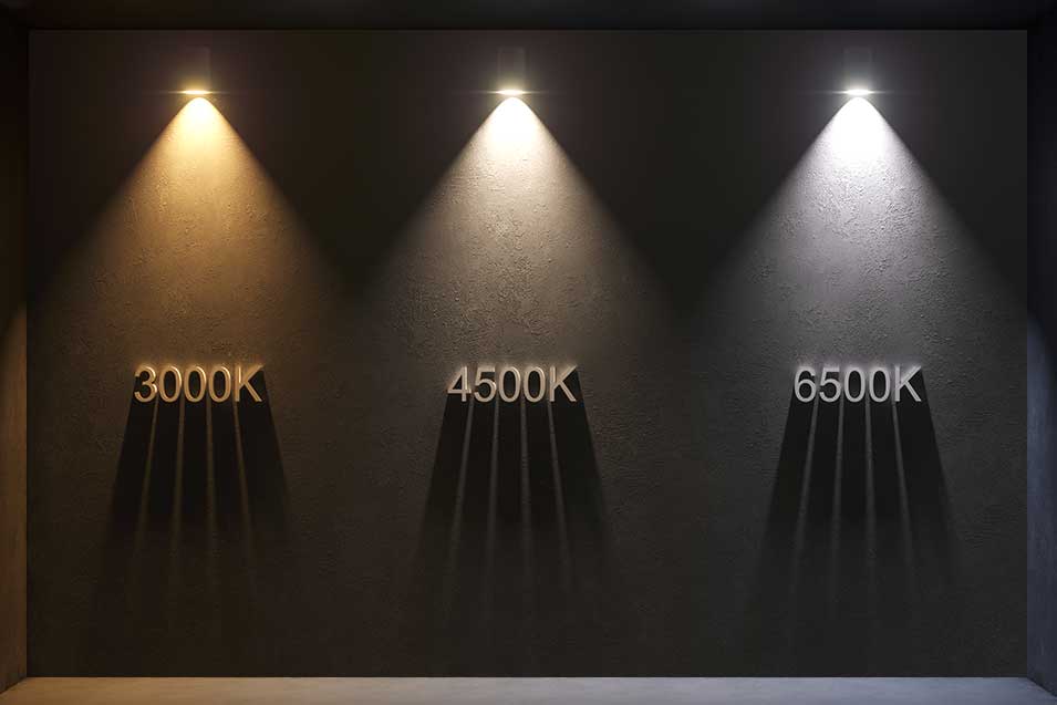
Colour temperature refers to the tone or appearance of light as seen by the human eye. Measured in Kelvins (K), colour temperature can range from warm to neutral, cool, and daylight. They are typically found in the range of 2700K-6500K.
Light Colour Temperature Chart (Kelvin Scale)
| Colour Temperature | Appearance |
|---|---|
| <3000K | Warm/Yellowish Light |
| 3000-4000K | Neutral White |
| 4000-5000K | Bright White |
| 5000–6500K+ | Daylight/Bluish |
Types of Light Colour Temperatures & its applications
Having knowledge of different colour temperatures can help you select appropriate lighting for different spaces. Let’s understand the main types in detail.
-
Warm White (Below 3000K):
Warm white light creates a warm ambience and a cosy, inviting environment. It emits rich golden hue that reduces eye strain.
-
Neutral White (3000K–4000K):
Neutral white light sits between warm white and cool white; it is a balanced form of colour temperature. It appears clean, natural white, comfortable on eyes while still providing bright visibility.
-
Cool White (4000K–5000K):
Cool white light emits a bright, crisp white light with a subtle hint of blue, creating a clean and focused environment. It is often used in offices, retail stores, and workspaces where clarity and concentration are essential, as it helps enhance alertness and productivity.
-
Daylight (5000K–6500K):
Daylight colour temperature is closest to the natural daylight and emits a blue-white light. It improves visibility and clarity, especially for tasks like studying or cooking.
Best Colour Temperature for Every Room
-
Living Room:
For living rooms, a warm white to neutral white colour temperature of around 2700K–4000K works well. 2700K–3000K creates a cosy and relaxing atmosphere, while 3500K–4000K offers a brighter, more balanced look for modern interiors and everyday activities.
-
Bedroom:
For bedrooms, a warm white colour temperature of around 2700K–3000K is ideal. It creates a soft, relaxing atmosphere that feels comfortable in the evening and is well suited to winding down before sleep.
-
Kitchen:
For kitchens, a neutral to cool white colour temperature of around 3500K–5000K works well. It provides brighter, clearer illumination that helps with food preparation, cooking and cleaning while keeping the space fresh and functional.
-
Bathroom:
For bathrooms, a neutral to cool white colour temperature of around 3500K–5000K is a good choice. It provides clear, bright illumination for grooming and daily routines while keeping the space looking clean and fresh.
-
Study Room & Home Office:
For study rooms and home offices, a neutral to cool white colour temperature of around 4000K–5000K is ideal. It provides clear, focused illumination that supports reading, computer work and other tasks while keeping the space bright and alert.
-
Pooja Room:
For pooja rooms, a warm white colour temperature of around 2700K–3000K works best. It creates a calm, welcoming and serene ambience while giving the space a warm, traditional feel.
-
Balcony & Outdoor Areas:
For balconies and outdoor areas, a warm to neutral white colour temperature of around 3000K–4000K works well. It creates a welcoming ambience while providing enough visibility for pathways, seating areas and general outdoor use.
Importance of Colour Temperatures
Light colour temperatures significantly impact our moods and productivity, it influences the perception of space and environment. It impacts our circadian rhythm that affects our sleep cycles, alertness, and mood.
- Warm white light creates a cosy, warm, and relaxing ambience. It is used for spaces where we want to relax and be comfortable.
- Neutral white offers a balanced and natural atmosphere that feels clear yet comfortable.
- Cool white light produces a clean, bright light ideal for spaces that demand both visibility and warmth.
- Daylight delivers a stimulating ambience that mimics natural daylight that improves concentration and colour accuracy in task-oriented zones.
Colour Temperature vs Brightness: Kelvin vs Lumens
Colour temperature and brightness are two different aspects of lighting, and understanding the difference helps in choosing the right light for each space.
Kelvin (K) measures the colour appearance of light. Lower colour temperatures, such as 2700K–3000K, produce a warm, yellowish while mid-range temperatures around 3500K–4000K create a neutral white light suitable for kitchens, bathrooms and general-purpose areas. Higher temperatures, such as 5000K–6500K, produce a cooler, whiter light preferred for task-oriented spaces.
Lumens (lm), on the other hand, measure the amount of visible light produced, or simply how bright the light appears. A higher lumen output means a brighter light, regardless of whether the light is warm or cool in colour.
In simple terms, Kelvin determines how warm or cool the light looks, while lumens determine how bright it is. Choosing the right combination of both helps create lighting that is comfortable, functional and suitable for the purpose of each room.
What Is CRI and Why Does It Matter?
CRI (Colour Rendering Index) measures how accurately a light source reveals the natural colours of objects compared with natural light. It is measured on a scale of 0 to 100, with a higher CRI indicating more accurate and natural-looking colours.
For most homes, a CRI of 80 or above is generally suitable for everyday lighting, while a higher CRI can be useful in areas where colour accuracy is more important, such as kitchens, dressing areas, artwork displays or retail spaces. Choosing lighting with a good CRI can make interiors, furnishings, food and skin tones appear more natural and visually appealing.
Tunable White & Smart LED Lights: Change Colour Temperature Anytime
Tunable white LED lights allow you to adjust the colour temperature of the light according to the time of day, activity or mood. You can switch from a warm, relaxing glow in the evening to a cooler, brighter light for tasks such as reading, cooking or working.
Smart LED lights offer even greater convenience by allowing colour temperature and brightness to be controlled through an app, remote or compatible voice assistant. This flexibility makes it easier to create the right lighting ambience for different rooms and occasions without changing the light fixture itself.
How to Check Colour Temperature on an LED Bulb Pack
Look for the Kelvin (K) rating printed on the LED bulb packaging. This number indicates the colour temperature of the light—for example, 2700K–3000K gives a warm white glow, 4000K appears neutral white, and 5000K–6500K produces a cooler white light. Some packs may also mention terms such as Warm White, Neutral White, Cool White or Daylight alongside the Kelvin value.
Conclusion
Choosing the right colour temperature not just enhances the space aesthetically but also boosts the productivity and emotional experience in a space. Hence, understanding right colour temperatures is essential for creating the right atmosphere.
Frequently Asked Questions (FAQs) :
-
Q1. Which colour temperature is best for home?
For most homes, warm white to neutral white light (around 2700K–4000K) works best. Warmer light suits bedrooms and living rooms, while neutral white is better for kitchens, bathrooms and work areas.
-
Q2. What is the difference between 3000K and 6500K?
3000K produces a warm white, slightly yellow light that feels cosy and relaxing, while 6500K gives a much cooler, bluish-white daylight effect that appears brighter and more energising.
-
Q3. Is 6500K light good for the eyes?
6500K light is generally safe for normal use, but its cool, bluish-white appearance can feel harsh or glaring, especially at night or in relaxing spaces. For long periods of reading or evening use, a warmer or neutral colour temperature is often more comfortable.
-
Q4. Is warm white or cool white better for studying?
For studying, neutral to cool white light (around 4000K–5000K) is usually better because it provides clear, focused illumination without feeling overly harsh. Warm white is more relaxing and is generally better suited to bedrooms or evening ambience.